


Kosi Hidama is a Japanese-born artist based in Belgium, working primarily in ceramics. Originally from Okayama, Japan, Kosi began his artistic journey as a dancer after graduating from Nihon University College of Art. His pursuit of contemporary dance brought him to Belgium, where he performed with internationally renowned companies such as Rosas and Needcompany, as well as numerous independent projects.
In 2011, during a support initiative for artists affected by the earthquake in Japan, Kosi encountered a group of potters from Fukushima. That meeting marked a turning point in his creative life and sparked his transition into the world of ceramics. A few years later, he met Axel Vervoordt, the globally respected interior designer and gallerist. Impressed by Kosi’s work, Vervoordt invited him to collaborate on a project in Tribeca, New York. Since then, their creative partnership has continued, with Kosi producing ceramic works for Vervoordt’s various international projects. Now working as an independent artist, Kosi creates ceramics that reflect a life lived between cultures. Drawing on his Japanese heritage and decades of life in Europe, his work embodies a harmonious blend of influences. His style is quiet, refined, and deeply rooted in the philosophy of wabi sabi—an aesthetic that embraces imperfection, simplicity, and the beauty of transience.
Through his work, Kosi offers not just objects, but experiences—meditative moments of reflection shaped by hand and guided by a life steeped in movement, change, and quiet observation.


Tom Andries (1969) is a Belgian multidisciplinary designer and contemporary artist. His main body of work consists of abstract monochromes painted with black ink. Originally trained as a typographer and having made a generous career in graphic design and branding, Tom uncovers the hidden beauty of typography, by zooming in on its intrinsic abstract qualities. Inspired by minimalism, modernist painting and mid-century architecture, his work reflects an ongoing quest towards the absolute bare essence of art.
The proof is in the painting. The largest part of Tom’s work-process is absorbed by the meticulous preparation of a heavily texturised black ink – a mix of acrylic, Indian ink and charcoal – which he generated himself and has perfected over the years. The act of painting consists of but a few sudden and concise strokes of the heavy brush within a short frame of time, referencing to gesture painting. All is done in complete silence.


An Selen (1975) is a Belgian artist based in Schilde, inspired by old things and nature. The scrapes, the dents, rust, a chipped wall, cracks. Finding beauty in the aesthetic of imperfect things in existence. A needed antidote to our consumption-driven world. Creating is a never ending process of growth and exploration. Light-weight concrete panels allows her to work more organically and authentically. “It gives me so much more freedom to express depth without limitation.
“To me, art is not a work of art but a piece of work in which the form is built up only to have pieces or holes drilled out or cut. Its imperfection completes it for me. I love the artistic reinvention of concrete because it is a rewarding natural product which I eventually finish with natural pigments.”


Geoffrey Lambert (1985, Brussels) s a self-taught designer/maker/artist who dedicates a broad knowledge of materials and techniques to an intrinsic aesthetic. His field of work covers a broad range. He creates furniture and sculptures or in-situ installations. He is passionate about scenography and exhibition design.
In his design objects, function does not disappear completely, but is no longer the object’s raison d’être. By exploring the process of burning, the maker searches for the soul of the specific wood he holds in hand.
Geoffrey researched this technique for years and continued to refine it. The many varieties of black and the different textures continue to fascinate him. The burning abstracts the wood until only the essence remains, that which comes alive in the imagination. The creative process as a slow attempt to capture what is elusive.
On the basis of his own practice, Geoffrey founded IMAGINAIR together with Katrien, in which the duo brings to life the different media they work with in a multi-disciplinary world.


Monica Piloni (b. 1978) is a Brazilian sculptor currently based in Brussels and active on the international stage. Her work evokes feelings of discomfort and unease. Since the beginning of her career, Piloni uses the female body, perfectly proportioned according to contemporary ideals, as a device to transmit her critique on today’s age. The idealized body becomes dismembered and torn, envisioning a ghostly whirlwind of contorted flesh and emotions.
The sheer feminism encompasses only the first paragraph of her narrative. Upon closer inspection, her sculptures open up to a more universal discourse of our daily lives—the ubiquitous unease induced by war, neoliberal capitalism, dehumanizing technology, and the shifting of power structures toward hyper-male conservatism. With her sculptures, Piloni says, “Look at the reality we are facing,” yet not without a certain irony. The mangled bodies were created by society itself. The snake bites its tail.
At High Numbers Gallery, Piloni exhibits ‘Odd’ and ‘IdEgoSuperego 20%’, both made of bronze. For Odd, Piloni used her own body during the model-casting and created a radial rather than asymmetrical being. The body points in all directions yet remains faceless; elevates in the air like atransient being yet sits on crutches. IdEgoSuperego20% takes its shape from the scorpion pose in yoga. By once again creating a triangular shape, Piloni alludes to a viscious circle where the ego struggles to feed its own growth and demise.
Although generating a raw and unfiltered view of the body and the world we live in, Piloni’s work remains poetic and sensual. The viewer becomes perturbed but not repulsed. Reminiscent of classical allegories, Piloni merges operatic drama with Eastern resignment. All figures maintain nonfunctional anatomies, reflecting how incapable we as humans have become to evolve—yet flexible at the same time, always adapting to the turmoils of life.

Bronze
Unique work
127cm × 170cm × 74cm
High Numbers Gallery
1800
More info
Bronze
5/20 (trios)
12cm × 15cm × 18cm (each)
High Numbers Gallery
1800
More info
Bronze
Unique work
180cm × 96cm × 96cm
High Numbers Gallery
Price upon request, rental options possible
More info


Price upon request, rental options possible
Bronze Unique work 180cm × 96cm × 96cm
1800
Bronze Unique work 25.4cm × 34cm × 14.8cm


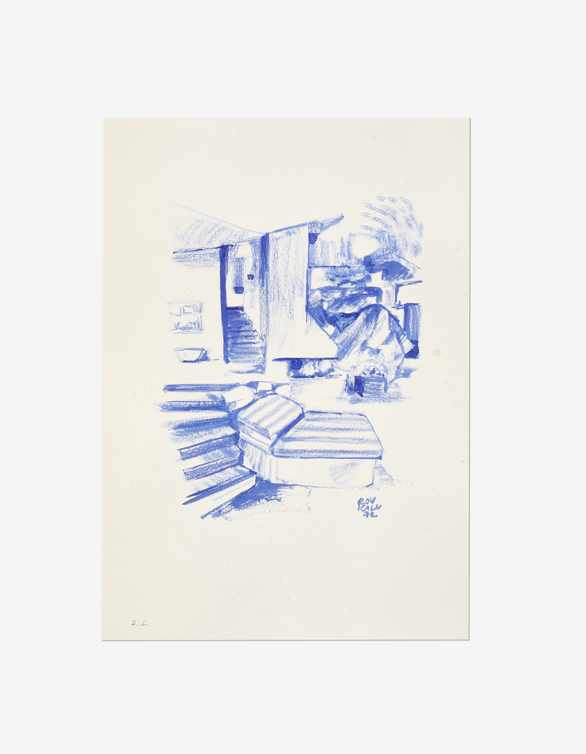
Robert Karl Illiovári, known under the pseudonym Roy Kill, is a Swiss-Bulgarian painter and draughtsman who moves through the world as both witness and fugitive, lingering where opulence meets oblivion. A restless observer of the exquisite debris of the beau monde, he drifts through Zurich, Monaco, Palm Springs, and Medellín’s most rarefied enclaves, never quite belonging. His chosen subjects speak not of what is permanent, but of what is destined to vanish.
Roy Kill’s oeuvre captures the essence of superficiality, wrenching it from its deepest roots and laying it bare on canvas and paper. Rejecting all pretence of profundity, he has no interest in depth, only in the echoes of surfaces—an aesthetician of the void, a chronicler of gloss. His work elevates ephemerality to the status of permanence, treating the fleeting not as something to mourn but as the only enduring truth worth preserving. Both decadent and incisive, it is an homage to the beautiful ugliness of our impermanent minds and world.
Though quite active in the 1970s, Roy Kill never sought the stage, avoiding both the critical spotlight and the gravitational pull of fame. His sudden disappearance from the scene only deepened the mystery—was he too close to discovery, too disinterested to seize it? Or was he hiding something, a man who walked the thin line between observer and voyeur, capturing the world with a gaze that is both detached and intimate?
What we do know is this: he never stopped drawing. His tools—ink, brushes, and a pocketful of pencils—always within reach, ready to commit a moment to paper before it dissolves into memory. He does not refine; he does not reconsider. The first stroke remains, uncorrected, unrepentant. His surfaces become immediate sites of execution, each piece spontaneous, unburdened by hesitation, untouched by regret.
More information or price request:
hello@highnumbers.com
Acrylic paint on cardboard (framed)
Unique work
180 cm x 120cm
High Numbers Gallery
6000
More info
Acrylic paint on cardboard (framed)
Unique work
180 cm x 120cm
High Numbers Gallery
6000
More info
Acrylic paint on cardboard (framed)
Unique work
180 cm x 120cm (framed)
High Numbers Gallery
6000
More infoPrice upon request, rental options possible
Bronze Unique work 180cm × 96cm × 96cm
1800
Bronze Unique work 25.4cm × 34cm × 14.8cm


Jørgen Missotten is a Belgian artist with a strong fascination for the surface of light. Both his painting series Clouds and Peeling Light frames the view of the audience on perfectly abstract monochromes in which the reflection of light symbolises the mirroring of the inner self. Provoking introversion, Missotten himself works in complete solitude from his home outside the city of Brussels with a framed view on the greenery of the local nature.
Missotten started off as a sculptor with a strong affection for raw materials such as black marble. His sculptures, meandering between design and art, gained international acclaim and consisted of meticulously polished surfaces that would reflect the light so adamantly that the three-dimensional stance of the material would disappear, reducing the marble into a two-dimensional surface. In recent years he translated this light-effect onto the canvas; painting being the blueprint for his creative endeavours since the beginning.
With his paintings, he now forces the light into a frame, creating condensed images for the viewer to immerse. In Clouds, Missotten portrays the dispersed light from thick cumulus and layers planes of paint into minutely detailed gradients. With Peeling Light, Missotten scrapes off a very thin slice of sun-ray and presents it as if under a microscope. Convinced that the coincidental shapes of nature are far superior to man-made objects, his act of painting consists of an accidental gesture of the brush during a meditative state of mind, attempting to flee away from any cultivation into the realm of pure natural self.
More information or price request:
hello@highnumbers.com
Price upon request, rental options possible
Bronze Unique work 180cm × 96cm × 96cm
1800
Bronze Unique work 25.4cm × 34cm × 14.8cm


Bemelmans Design is a Belgium-based studio founded one year ago by designers, and former classmates, Wout Bemelmans and Lode Debackere. The studio focuses on high-end collectible design which is completely made by hand in Belgium. Their first series called The BOLD Collection consists of elementary design objects made of solid wood and vibrant lacquer, intertwining primitive and modernist typologies into contemporary archetypes.
Bemelmans used the condition humaine as a starting point. Being trained as designer and a psychologist, he analysed the current temperature of society and came to the conclusion that people crave for reconnection both on an inter-human and man-to-object level. During his quest to translate this tendency into furniture, he reminisced about the bare furniture his grandfather, a farmer, made for daily use. This heritage would finalise the aesthetics of the young designer.
In terms of composition and construction, Bemelmans’ work marks the conjuncture of brutalist architecture and vernacular design. The materials and techniques of the recent and the far past — woodwork and Danish rope-weaving — are contrasted with rounded corners and a softening lacquer, creating a specific visual identity that provokes feelings of gentleness and humaneness. Furthermore, Bemelmans uses colour as a material. Eschewing pre-existent schemes, he instead searched for meticulous hues that would layer the object instead of covering it. In short, Bemelmans Designs The BOLD Collection bravely sets out to seek balance in today’s current of extremes..
More information or price request:
hello@highnumbers.com
Price upon request, rental options possible
Bronze Unique work 180cm × 96cm × 96cm
1800
Bronze Unique work 25.4cm × 34cm × 14.8cm


Tom Andries (1969) is a Belgian multidisciplinary designer and contemporary artist. His main body of work consists of abstract monochromes painted with black ink. Originally trained as a typographer and having made a generous career in graphic design and branding, Tom uncovers the hidden beauty of typography, by zooming in on its intrinsic abstract qualities. Inspired by minimalism, modernist painting and mid-century architecture, his work reflects an ongoing quest towards the absolute bare essence of art.
The proof is in the painting. The largest part of Tom’s work-process is absorbed by the meticulous preparation of a heavily texturised black ink – a mix of acrylic, Indian ink and charcoal – which he generated himself and has perfected over the years. The act of painting consists of but a few sudden and concise strokes of the heavy brush within a short frame of time, referencing to gesture painting. All is done in complete silence.
For the exhibition Hidden Landscapes of Letters, also the title of his monograph, Tom delves deeper into the very essence of typography: the grid. Every letter is shaped in relation to a certain framework. By using standard DIN paper A-formats and common canvas sizes, the work-field of the letter becomes even more part of the composition. Also for the first time, Tom has painted solely the grid and not the letter, wandering through the landscapes of pure form.
More information or price request:
hello@highnumbers.com
Price upon request, rental options possible
Bronze Unique work 180cm × 96cm × 96cm
1800
Bronze Unique work 25.4cm × 34cm × 14.8cm
